Design and Prepress tools for beginners
to professionals
Free shipping worldwide
On this single page we have collected affordable solutions that enable any
designer, brand manager, printshop or manufacturer to be the best when
it comes to colour management and complete control over their colours,
be it for screen, print or textile production with primary emphasis on
brand colours and brand colour management.
Spot-Nordic offers solutions from many of the best manufacturers in the
graphics industry but on this page we focus on design, brand colours and icc colour
management and cutting edge products for design and prepress.
The tools that you find here are reasonably priced, v.s. how important
they are to ensure professional colour for even the most demanding
brands and the very best printshops and manufacturers in all sectors.
Colour Management has for the longest time been a dirty word for
designers and many printshops, which is why to this day many brand
colours are not properly defined, - meaning that the colours of the
brands appear different in the different media.
This is why, in 2018, we launched the Spot Matching System, which is a
3C (Cross-media Colour Consistent) colour palette of 2.607 different colours
in a total of 6 different versions, ranging from Cyan to
Magenta to Yellow and Black and anything in between (see picture on the
screen here below), which aims at complete colour consistency in all
media.
The Spot Matching System - or SMS for short enables designers
to use SMS colours in their design and to use the same SMS colour(s)
online, on Television and in standard CMYK printing (used for printing
of colour images and layouts) for both coated and uncoated paper or for
other materials, such as textile.
For more information on the Spot Matching System, please check out
www.spotmatchingsystem.com.
We have now taken a new step towards our goal of ensuring complete
colour consistency globally by releasing the first SMS READY Spot-Nordic
laptop, optimized for
SMS design with a customized SMS colour palette (ECO, Standard or MAX)
which was built using the colour gamut of the Spot-Nordic P60 ColourBox
laptop display.
We refer to this special version of our colour palettes as SMS Home & Office.
In line with the SMS approach to colour, the SMS Home & Office colours you see on your laptop monitor have been verified to in fact be the colours you should see when you print the same SMS colours on coated or uncoated paper at your local printshop, - or even on your own office printer (depending on the quality of the office printer).
The colour gamut of the P60 ColourBox laptop is approx. 60% of the sRGB gamut
which is in fact quite common among PC laptops of various brands used by
millions of people around the world (including brand owners), so it is
safe to say that the Home & Office colour palettes are even more
practical
for brand design than the original (sRGB) SMS colour palettes,- if the
goal is to ensure that your SMS colours look the same to as many people
as possible, - also on their PC office laptops.
This approach can be referred to as a "turnkey" solution or a closed-loop, so
brand owners that choose to use the Home & Office colours for their
brand/trademark can simply buy the inexpensive Spot-Nordic P60 laptops
for themselves and their staff that need to evaluate their SMS Home &
Office colours on their own screen in the comfort of their home or
office. The Home & Office colour palettes (Standard and MAX - each
consisting of 1.738 colours) are delivered in PDF format, sRGB (same as
the original SMS colour palettes) so if the sRGB icc colour profile is
embedded to your Home & Office bitmap images, your SMS Home & Office colours should look
identical, whether you view them on a regular PC laptop (or the P60
laptop) or an expensive Mac display.
That is what this is all about. If you would like some of your
photographs also to be optimized for the P60 gamut, you can now order
them from Spot-Nordic.
Here below are the products that we consider to be everything you need
to be in perfect control of your colours, whether you are a brand owner,
a student of
graphic design, a professional designer or in charge of production at a
professional printshop or manufacturing facility in any industry sector.
Be advised that due to the latest development in the USA, there may be
tarifs added on top of the prices here below on import to your country -
especially if you happen to be located in the USA.
Value Added Tax (VAT) is added on top of the combined price with tarif
on import of products to your country.
Some of the products here below are shipped from Europe and others are
shipped directly from our manufacturers in China to keep down the
freight prices = the final price to you.
A 1 year Manfacturer Warranty is offered for all products here below.
Feel free to contact
info@spot-nordic.com to discuss your requirements, regardless of
your location.
Spot Matching System
![]()
The Spot Matching System (SMS) is created for so-called Brand Design, - i.e. for brands to use SMS colours in their official brand logos and as their official brand colours.
The system is a device-independent, LAB based, professional colour palette, containing a total of 8.690 colours for 21st Century demands in design, where visual predictability and consistency in colour from product to marketing in any mainstream media is a key factor.
Device-independent means that SMS colours don't depend on just one device - or media for that matter. Using modern icc colour management, they can be reproduced in RGB on digital displays and in process printing on coated or uncoated substrates, be it standard CMYK for offset, gravure or flexo printing presses, for digital printing on paper or textile. SMS colours can additionally be reproduced using analog paints and dyes.
The main advantage of the Spot Matching System is that both our standard SMS colours and our ECO colours fulfil the criteria that designers can use the same SMS colours consistently in standard CMYK printing on coated paper, CMYK printing on uncoated paper, for standard digital displays such as laptops, tablets and smart phone displays and on TV/Cinema, maintaining the same colour(s) visually for side-by-side comparison.
This consequently means that you can easily communicate the expected visual appearance of your SMS colours, as they should look when printed in CMYK on paper or when they are displayed online or on Television with your customer and stakeholders around the world instantly via email or a website to take the guesswork out of the equation and to speed up your work.
Since the Spot Matching System is based on fixed LAB values, of course any product can be manufactured in SMS colours using existing, proprietary inks, paints or dyes to ensure correct colour of the final product. This means that any product manufactured and dyed using SMS colours can also be marketed colour correctly in any mainstream media to maximize customer satisfaction.
In general, to view SMS colours correctly on a monitor, the monitor has to be capable of displaying 100% of the sRGB colourspace and in the case of Television screens 100% of the Rec. 709 colourspace.
To keep your display correct it has to be calibrated regularly - preferably at least every 2 weeks.
The SMS Home & Office versions as well as the ECO colours are perfect, if the goal is to use colours for devices only capable of displaying approx. 60% of the sRGB/Rec. gamuts, - to be able to show your true SMS colours to a larger audience.
For more details on SMS products visit the SMS website or visit our webshop to order your SMS colours.
Contact
support@spotmatchingsystem.com if you have
questions.
P21
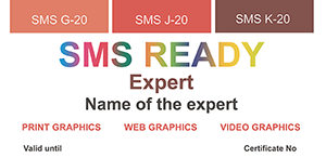
SMS READY Expert diploma
The certificate confirms the ability of the certificate holder to use SMS colours in design, how to convert them correctly from sRGB to other colour spaces, ensuring correct reproduction of said SMS colours and how to check if SMS colours in PDF documents are correct or not.
SMS READY Experts may always contact support@spotmatchingsystem.com for technical assistance.
Included in the price of the certificate is the SMS Standard Home &
Office colour palette or optionally another SMS colour palette.
SMS READY Experts are authorized to assist registered SMS users and SMS
subscribers onsite or remotely (designers, brand owners,
printers, manufacturers) within their respective category
(PRINT, WEB, VIDEO) as well as to take the role of
so-called "super users" at SMS certified agencies, print shops
and subscribed brands/companies - see SMS certification and
subscription plans
here.
More details on the SMS READY Expert training here.
SKU P21 - EUR 250
Contact support@spotmatchingsystem.com to order or order online.
Spot-Nordic P60 ColourBox (SMS Home & Office colours)
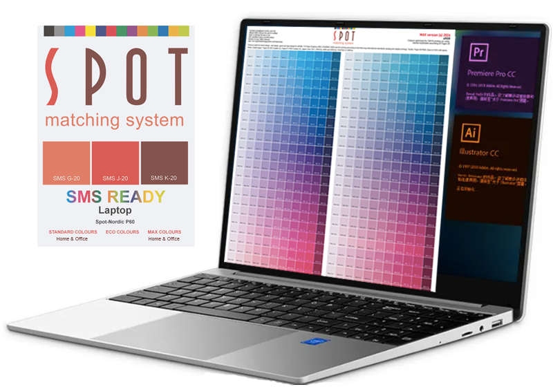
The Spot-Nordic P60 ColourBox is a light weight laptop, well suited for the home,
office
and school, but more important, it is well suited for on-the-go advanced
to professional design using the brand new Spot Matching System Home &
Office colour palette(s),
for web design, TV graphics or CMYK print design at professional/brand
level.
The P60 is not the fastest laptop nor does it have all the latest bells
and whistles and it does not have the best and the most vibrant display
available either.
It is however the first SMS READY
certified PC laptop in
the world.
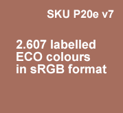
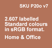
The P60 laptop is capable of displaying the SMS ECO v7, the SMS Standard Home & Office v7 and the SMS MAX Home & Office v7 colours, - a total of 2.607 x 3 = 7.821 distinct, labelled brand colours for professional brands, optimized for web, Television and CMYK printing to universal standards, correctly in sRGB format, when the display is calibrated.
The P60 ColourBox display is a "typical" PC laptop display, capable of displaying approx. 60% of the colours of the sRGB colourspace/45% of the NTSC colourspace.
In order to see the exact colours of the original version of the Spot Matching System (SMS Standard v7, SMS MAX v7 and SMS SuperMAX v7), you need a display capable of displaying at least 100% of the sRGB colourspace.
According to our research a large portion of newer PC laptop and notebook displays are in this range - i.e. capable of displaying approx. 60% of the sRGB colourspace (approx.% of the NTSC colourspace).
That again means that a large portion of customers around the world are NOT seeing even the quite subtle, generic SMS brand colours correctly on their PC laptop displays, while brands that select colours from the SMS ECO or the SMS Home & Office colour palettes can rest assured that most people around the world are able to view and evaluate their brand colours correctly on their cheaper laptop displays, - as well as other displays with larger colour gamuts of course - 100% sRGB or better (P3/Adobe RGB etc.).
That is why we developed the Home & Office versions of our SMS Standard
and MAX colour palettes, optimized for the P60 display - and similar
displays from other manufacturers. Fortunately
our super natural SMS ECO palette is subtle/natural enough to be
correctly displayed on displays with this slightly muted colourspace.
The reason Spot-Nordic decided to offer its own laptop, is the strange
situation of the graphics industry, which in itself makes it way more
complicated to keep track of brand colours on a universal level than it
was just 35 years ago, when brands basically only had to worry about
keeping their spot colours printed on paper correct.
In our modern digital world Apple monitors and displays are safe to use when working with the original SMS colours and many colours from other colour systems, due to the native large P3 colourspace of Apple displays, from their iPhones to laptops and monitors.
Apple has been extremely successful in winning over the graphics market and hence most graphic designers and anyone involved in the colour industry only use Apple displays. Some super professionals also use Eizo displays. This was fine while we only had Pantone, RAL and NCS colours to work with, all of which rely on printed samples for designers to work with to pick and communicate their requested colours.
At the
same time we see a trend where more and more graphic designers and
design agencies are actually no longer relying on printed colour guides to pick
out brand colours, but have instead switched entirely to picking digital colours
of their (superior) displays.
Designers who are not colour
specialists as well may in this environment be tempted to rely entirely
on their super
vibrant colour monitors to pick out colours for their designs, - colours that look beautiful on
their expensive Apple display (capable of displaying the P3 or Adobe RGB colour
gamut), while, when they convert the logo to sRGB, the logo will look
much duller visually - and to make it even worse, as dull as the logo
looks in native sRGB format, on monitors displaying only 60% of the sRGB
gamut, that perhaps half of the
audience is using, the logo will not even resemble the original, super
vibrant logo.
It is our perspective at Spot-Nordic that professional designers should only use colours that can be viewed correctly by any consumer, - otherwise the colours cannot be considered anything but a humbug that only looks good at the design studio and perhaps when printed on a proof during the initial corporate image presentation by the agency, which is worth nothing, when it comes to brand design and could be considered fraud from our perspective, since the colours being sold to the brand owner will in most cases never be presented correctly to the public.
From our perspective using super vibrant colours for a brand logo/brand colours is about as professional as getting lost in 3D effects and forgetting the initial concept of the logo.
It is our opinion that all prospective customers should be able to see the actual brand colours of any brand that they wish to do business with to the extent that any brand should be able to market itself using only its colours (not it's logo) - and by keeping the colours visually consistent in all media, with time, customers will start to recognize the brand by it's colour(s). This however requires the brand to use SMS colours - since SMS colours are made from the scratch to remain visually identical in all media.
A professional logo/corporate identity can be successfully designed in black and white if the designer knows what he or she is doing. This is in fact one of the main reasons why so many world famous logos are simply black or neutral gray - because colours are not required - and probably also because that before SMS colours came along, colours could not be relied on to appear the same in all media. A good example of such a logo is in fact the new Apple logo, which is neutral gray.
Included in the purchase of the P60 laptop, we are including a total of
7.821 SMS colour shades that are as safe to use as
black and gray - and they remain the same in all media and for any
purpose, as long as you know the LAB values of your SMS colours.
We are furthermore offering the P60 ColourBox laptop at a reasonable price, so it
is a perfect gift for designers and design students as well as a perfect
laptop for designers and creatives that prefer a PC to an Apple or are
simply not willing to pay 1.500 or 2.000 Euros for a laptop.
Furthermore, for designers and design
agencies that usually only use Apple displays in their day-to-day work,
it is a really good idea to invest in at least one P60 ColourBox PC
laptop to preview what their designs actually look like in the real
world, where most people use PC laptops and Android smartphones and
tablets. This could be referred to as real-world proofing.
The Spot-Nordic P60 ColorBox laptop is custom built for Spot-Nordic according to
our specifications and it is actually the laptop that we use at the
office, for onsite and remote presentations so you could say that we put our money where our mouth
is and we only recommend products that we ourselves have tested - or use
on a daily basis, like the Spot-Nordic P60 laptop, the Calibrite Display
Plus HL calibration package and the ColorMeter
Exact spectro - see here below.
A copy of the Home & Office version of SMS Standard v7, SMS MAX v7
and the SMS ECO v7 colour matching system in PDF, sRGB format - a total
value of EUR 420 is included
in the price of the Spot-Nordic P60 ColourBox laptop.
For information on the Spot Matching System (SMS) and the difference
between the SMS ECO, SMS Standard, SMS MAX and SMS SuperMAX colour palettes, refer to
the
SMS website.
If you order SMS READY Expert training (see above) at the same time you order the
P60 laptop, you only have to pay and extra EUR 100 excl. VAT on top of
the price - and pass the test to get your diploma.
The P60 laptop is factory pre-calibrated, but for professional work
where SMS colours are used, - and simply to be sure that the colours you
see on your monitor as as correct as possible, we recommend a monitor
calibration package - see here below to keep your display 100% correct,
since all displays drift as time goes by.
The 123 package (see here below) is good enough for simple monitor calibration to avoid
trending.
P60 ColourBox -Specs
Colour: Silver
OS: Windows 11 Pro
CPU: Intel N95; Quad Core, 4 Threads
GPU: Intel UHD Graphics
CPU Clock Speed: 1.7GHz; Turbo: 3.4GHz
Screen: IPS 15.6inch, Resolution:1920*1080 (SMS READY for SMS Home &
Office)
Memory: DDR4 16GB
SSD: 512GB or 1TB
Camera, Front 0.3MP
Sound: Stereo, 8 ohm, 2 x 1w. 3.5 mm mini jack input.
USB: 1 x USB 3.0, 1 x USB 2.0.
Bluetooth 4.2
Battery: 5000mAH (approx. 4 hours of normal use)
WIFI: 802.11B/G/N&AC (5G support)
Weight: 1.6kg
Fingerprint Unlock
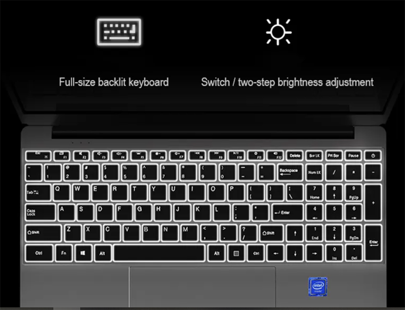
Backlit Keyboard: QWERTY English
SKU P60a - 16GB/512GB: EUR 599 excl. VAT and local tariff that may apply, depending on your location.
SKU P60b: 16GB/ITB: EUR 660 excl. VAT and local tariff that may apply, depending on your location
Contact info@spot-nordic.com to order or order online.
When ordering, please make sure to select either 220V or 110V version, whether you would like the EU (ISO) or US (ANSI) keyboard layout and whether you would prefer the silver coloured or pink coloured version.
Calibrite Monitor/display Calibrators
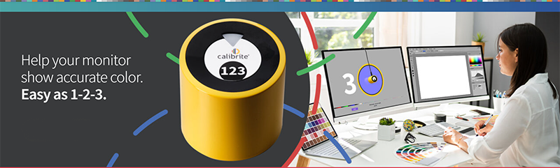

The Calibrite Display 123 is an inexpensive and easy to use monitor calibrator suited for users that are not colour management specialists but would still like to keep their monitor colour correct. This solutions is well suited for freelance designers and private individuals that do a lot of online shopping for instance.
2 monitors can be adjusted per package.
Included with the purchase of Calibrite 123 is one SMS colour palette v7 of your choice for professional design, containing 2.607 colours suited for web design, TV graphics and Print (CMYK) design valued at EUR 140.
Calibrite Display 123
+ 1 SMS colour palette
SKU P52a: EUR 259
excl. VAT and local tariff that may apply, depending on your location.
Contact info@spot-nordic.com to order or shop online.
Calibrite Monitor/Screen/Projector Calibrators (advanced to professional)

-
The new standard in calibration devices capable of measuring up to 10.000 nits
-
The advanced HL (high luminance) sensor enables greater colour accuracy for current and new display technologies
-
Accurately measures LCD, mini-LED, OLED displays and Apple XDR panels
-
Measurement and profiling of both displays and projectors (Display Pro HL and Display Plus HL)
-
Recommended for highest quality still image editing and design applications
-
Comes with Calibrite PROFILER software, featuring fully customizable features such as White Point and Gamma, Profile Validation, Uniformity Check features and more. Compatible with Mac and Windows OS
-
Compatible with some 3rd party monitor calibration software
-
USB-C connection, supplied with USB-A adapter
-
Smaller, fully recyclable packaging and includes a travel storage pouch
-
Adjustment of up to 4 displays per. package.
Included with the purchase of Calibrite Pro or Plus is one SMS colour palette v7 of your choice for professional design containing 2.607 colours suited for web design, TV graphics and Print (CMYK) design valued at EUR 140.
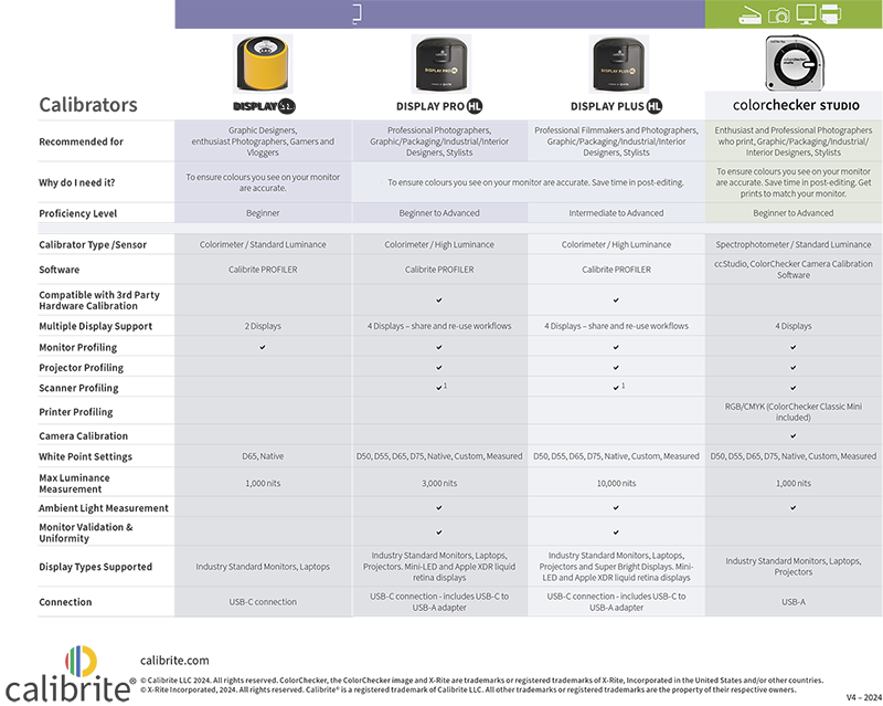
Display Pro HL + 1 SMS colour palette v7
SKU P52b: EUR 344
excl. VAT and local tariff that may apply, depending on your
location.
Contact info@spot-nordic.com to order or shop online.
Display Plus HL
+ 1 SMS colour palette v7
SKU P52c:
EUR 413
excl. VAT and local tariff that may apply, depending on your
location.
Contact info@spot-nordic.com to order or shop online.
ColorChecker Studio

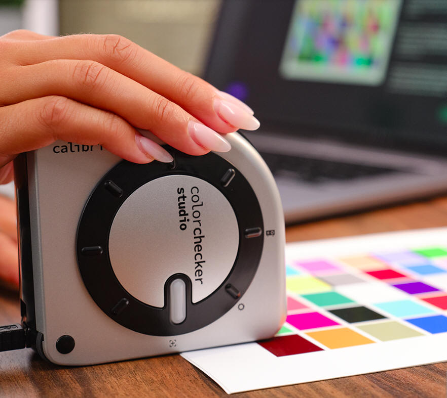
ColorChecker Studio and Calibrite PROFILER 3.0 with Custom
Printer Profiling built in…
|


|
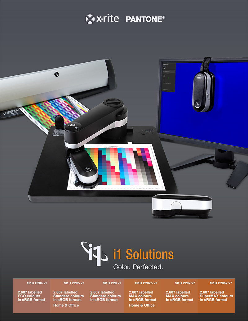
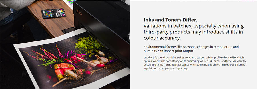
The Xrite i1 Pro 3 is an advanced, 45/0 handheld spectrophotometer, accurate enough for the most demanding customers, such as printshops, brand owners and advertising agencies seeking to get their colour under control. The i1 Pro 3 devices support measurement to M0, M1 and M2. In fact it is so accurate that the predecessor - i1Pro2 device was used to measure and confirm the colours of the first edition of the Spot Matching System (SMS) - to confirm the cross-media conformance of the SMS colours and the dE00 from one media to the next for our emperical proof. The i1 Pro 3 bundled with the i1 Profiler software can be used to measure monitors (up to 5.000 nits), projectors and printed colours on even substrates, such as paper and plastic. For measurement of more uneven substrates such as textile, canvas, ceramic or film - as well as for BACKLIT displays (new) the big brother - the i1 Pro 3 PLUS instrument is more appropriate. Included in the purchase of all i1 Pro 3 packages and the i1 ISIS sheet scanner (see below) are all 6 colour palettes of the Spot Matching System, SMS READY Expert training for one individual and an SMS READY Agency certificate (optional) worth EUR 595 (SKU P43 - see catalog) - or a 2 year SMS READY print shop verification worth EUR 560 (SKU P44 - see catalog). See further information and overview of SMS products for professional design here. See further information and comparison on the i1 Pro 3 packages here. i1 PUBLISH software/upgrade from BASIC to PUBLISH: SKU XRIT468: EUR 1.690 excl. VAT and local tariff that may apply, depending on your location. Contact info@spot-nordic.com to order
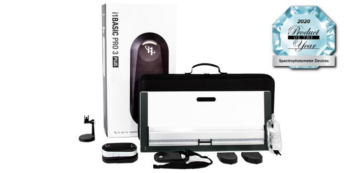
Ideal for use with 3rd party RIPs and software and profiling HD/HDR displays. i1Basic Pro 3 is a flexible solution for professional-level display monitor and projector profiling, monitor and printing quality verification, and spot color measurement. Designed to also work with 3rd party RIPs and software, i1Basic Pro 3 is an essential tool in a color-managed ecosystem. SKU XRIT075: EUR 1.990 excl. VAT and local tariff that may apply, depending on your location. Contact info@spot-nordic.com to order
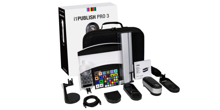
Ideal for profiling a complete workflow from concept to print. i1Publish Pro 3 is designed for any professional working in the prepress, digital printing, photography, or design industry who relies on totally accurate color throughout their digital workflow – from displays, scanners, and projectors, to RGB, CMYK and extended gamut printers and presses. This solution includes QA functions to check soft proofs and verify output quality, Optical Brightener Compensation (OBC) to easily adapt to any non-standard viewing environment, and Device Link for more accurate color source to destination conversions to stabilize the printing process and/or save ink in CMYK conversions. SKU XRIT077: EUR 3.190 excl. VAT and local tariff that may apply, depending on your location. Contact info@spot-nordic.com to order
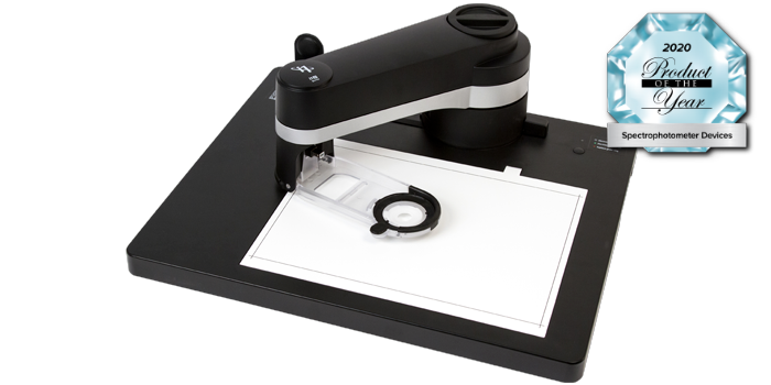
Ideal for use with 3rd party RIPs and software when printing on unique substrates and profiling HD/HDR displays. i1Basic Pro 3 Plus provides the same functionality as the i1Basic Pro 3 solution but includes a device with a larger aperture. It’s designed to work with 3rd party RIPs and software to create printer profiles for unique materials that are challenging to profile such as textiles, canvas, ceramic, film, and other backlit materials. i1Basic Pro 3 Plus accommodates larger test targets with the included longer ruler and backer board, making it ideal for wide and grand format printers. SKU XRIT085: EUR 2.190 excl. VAT and local tariff that may apply, depending on your location. Contact info@spot-nordic.com to order
Ideal for profiling a complete workflow from concept to print on unique substrates. i1Publish Pro 3 Plus provides the same functionality as the i1Publish Pro 3 solution but includes a device with a larger aperture. It’s designed specifically to create printer profiles on unique materials that are challenging to profile such as textiles, canvas, ceramic, film, and other backlit materials. i1Publish Pro 3 Plus accommodates larger test targets with the included longer ruler and backer board, making it ideal for wide and grand format printers. SKU XRIT087: EUR 3.690 excl. VAT and local tariff that may apply, depending on your location. Contact info@spot-nordic.com to order
I1 IO (3rd generation)
Robotic, automatic chart reading system to speed up and automate reading
of charts for profile creation. i1 PUBLISH PRO 3 or i1 PUBLISH PRO 3 PLUS package not included - see above. SKU XRIT480: EUR 3.990 excl. VAT and local tariff that may apply, depending on your location. Contact info@spot-nordic.com to order
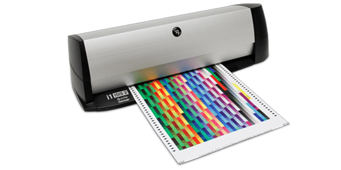
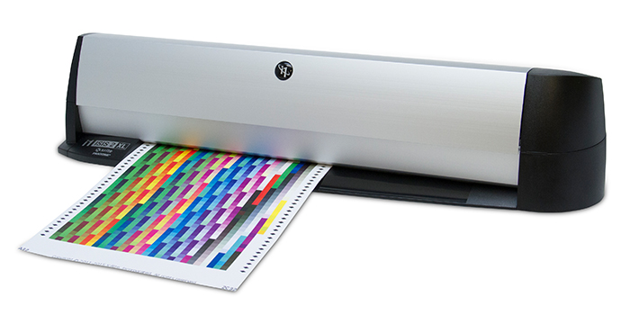
I1 ISIS 2 - standard Included in the purchase of an i1 ISIS 2 + a copy of the i1 Publish software from Spot-Nordic is a 1 year SMS READY printshop subscription valued at EUR 950 for printshops that offer printing of SMS colours with an accuracy of a dE00 of 3 or less for at least one international printing standard (Fogra, G7 or Japan Colour 2011) - see supported standards here.Included in an SMS READY printshop certification are all 6 SMS colour palettes and SMS READY Expert training for one employee - see more details here. Automate Your Profiling and CalibratingIn high production environments such as photo processing, large format, fine art and high-speed digital printing, frequent measurement of color test charts to keep color management profiles up to date is a must. With the i1iSis 2, this task no longer need be labor-intensive. Simply print the A4 test chart, read it into the i1iSis 2 in to process 1,500 patches in just 8 minutes, and check results. It’s that easy. The i1iSis 2 is compliant with the latest ISO standards for M-Series measurement illumination conditions, including:
Benefits:
|